 |
| https://cmmb.org/world-day-poor-special-reflection-pope-francis/ |
Count me among the many, Catholic and non-Catholic alike, who found in Francis much that was admirable and thought-provoking. The beginning of a recent New York Times article encapsulates what drew me to Francis the most:
Throughout his papacy, Francis was an outspoken advocate for the downtrodden. Shortly after he was elected in 2013 he said, “How I would like a church that is poor and for the poor.”
I shared this article by Elisabetta Povoledo with several family and friends, and received some thoughtful comments in return. Thinking about poverty, its causes, and what we might do about it, is a huge subject about which hundreds of books and thousands of articles are written. Here let me offer a few thoughts and a few facts, as usual many drawn from my teaching notes.
In this first post in the series, I will take an international focus, mainly on some basic facts about global poverty and related issues. A second post will bravely (?) explore some possible ways these issues can be -- and sometimes are -- addressed. Later I will post a pair of short companion pieces focusing on poverty facts and possibilities within the United States.
This is a long blog post, but a short taste of a vital and complex subject. To fit even a long blog format, all of four of these posts will necessarily skate over some very complex and sometimes controversial points, for example just exactly how we should best measure poverty. When I provide numbers, they’ll often be rounded and sometimes approximate. I’ll provide some references that dig into these important matters in more detail.
I welcome emails from readers who find mistakes or have other comments. Armed with some views of poverty around the world, even if these views are still “through a glass, darkly,” next month I’ll try to review some of the ways we might accelerate reductions in poverty, and just as importantly. perhaps avoid some policy mistakes that could take us in the wrong direction.
 |
| iStock |
Displaced persons camp, Juba, South Sudan, 2012. Photo by Vlad Karavaev
Key Takeaways
Significant Progress in Poverty Reduction: Over the past few decades, global poverty has declined markedly, with extreme poverty rates falling from 38% in 1990 to approximately 8.5% in 2024. This progress has been largely driven by rapid economic growth in countries like China, India, and Vietnam. International poverty comparisons often focus on "$2/day" thresholds of extreme poverty, but other measures are informative, and necessary. Most show improvement in the aggregate, but country-level results can vary.
Poverty Reduction Has Been Accompanied by Progress in Other Areas. Over recent decades, in the aggregate, incomes have risen, as have life expectancies, other public health indicators. More children are educated, vaccines are more widely available, more people live in democracies. But shortfalls remain. Some indicators are worsening, notably those related to climate change and biodiversity, but also some health issues such as diabetes. Social and political polarization appear to be increasing in a number of countries.
Inadequacy of the 'Global North vs. South' Divide: The traditional binary classification of countries into 'developed' and 'developing' is increasingly insufficient. Economic growth has led to the emergence of a global middle class, and poverty now exists in pockets within wealthy nations, highlighting the need for more nuanced analyses. A four-way classification of countries by per capita consumption is increasingly used by analysts. Beyond the numbers, photographic essays, literature and film provide important insights into the lived experience of people with different resources, both within and across countries.
Despite Overall Progress, Poverty is Still a Live Issue. Escaping extreme poverty (incomes over roughly $2 per day) still leaves large numbers of poor by less draconian standards (e.g. $4, $7 per day). Extreme poverty is still widespread in a number of countries, many of these in sub-Saharan Africa but extreme poverty can be found in other regions (Laos, Myanmar, Haiti, Honduras, Venezuela for example).
This post sets the stage for a future post that will discuss some of the causes of poverty, and some potential solutions.
iStock: Brazilian girl studying. Photo by Igor Alecsander
Introductory Facts
In the United States our current per capita GDP of about $82,000 translates into income of about $43,000 per capita. The official poverty threshold for a single nonelderly person is about $16,000 per year or about $42 per day.
A commonly used global threshold for
extreme poverty is about $2 per day. Such a threshold has numerous shortcomings and is frankly controversial, but we will stay with it for the moment. When the threshold was first put forward by World Bank analysts around 1990 it was loosely termed “a dollar a day,” but has morphed into (more or less, depending on source and year), $2 or so per day (most recently $2.15 in many sources, but sometimes we will refer to this as the $2 threshold for brevity). This is termed an “absolute measure,” identical across countries, intended to focus on poverty as experienced by the poorest people, mainly in the poorest countries. Virtually nobody in the U.S. or Western Europe consistently consumes at such a low level, although some individuals may experience spells of extremely low incomes, about which more another day.
For much of world history, extreme poverty, however crudely we measure it, was the lot of most humans. This chart from Martin Ravallion (2016), based on estimates from Bouruignon and Morrisson (2002) and Chen and Ravallion (2010), reminds us of that fact:
Notice that Ravallion's chart uses the earlier $1/day threshold for extreme poverty.. Two centuries ago, as best as we can tell, four of every five humans lived in extreme poverty. And 1820 was well into the second agricultural revolution, where standards of living, still bleak for most, were beginning to see some improvement from the past ten millennia since the first agricultural revolution and the first urban settlements; which in turn followed a few hundred thousand years of hunter-gatherer subsistence. Life for most was, in Thomas Hobbes' famous phrase, "solitary, poor, nasty, brutish, and short."
 |
| iStock; Hmong mother and son, Vietnam |
A Simple Framework, and More Definitions
A nation's, or a region's, economic output generates income for its population, which will be distributed in a particular way. The amount of income, and how it is distributed, are the most proximate determinants of poverty, however poverty is defined. We can think of this process as determined in turn by an environment, broadly defined, that includes our existing assets, human capabilities, "rules of the game" and many other things that we note briefly here but discuss further in a later post. While we usually think of output as determining income and its distribution, and hence poverty, as we show below, there are of course linkages in both directions and across the four classes of outcomes. For example, a poorer population, however defined, will surely be a less productive one, lowering output.

This figure helps us organize our thinking about key concepts which are sometimes confounded in the media. Google, say, “national incomes,” and most of the results will focus on Gross Domestic Product (GDP) which is the basic measure of (some of) a country’s economic output. GDP’s close relation Gross National Income (GNI) is GDP plus net income from abroad.
The portion of GDP, or output, that accrues to households or individuals drives various measures of incomes. These are most often reported using some measure of central tendency such as median household income, or per capita income (an average).
Income and consumption are closely connected, in the chart and in reality. It is worth remembering that the ultimate point of production, of GDP, is to distribute it as income, which in turn enables consumption.
Aggregates, medians, and averages contain important information, but there are also measures that tell us more about the distribution of incomes. The most commonly used measure is the Gini coefficient. This measure is
described in detail here, but for the moment we need only note that it is an index of the distribution of income ranging between zero and one. A country with complete equality, i.e. where each individual has exactly the same income, has a Gini coefficient of zero. A country where all income is captured by one individual and everyone else has zip has a Gini coefficient of one.
Obviously no real-world economies exist with Ginis of either zero or one. In modern economies, very loosely, a Gini coefficient of 0.3 to 0.4 is considered fairly low, indicating a reasonably widely diffused distribution; a coefficient at 0.4 to 0.6 or higher is considered fairly high.
One issue with the Gini coefficient is that it increases both as the top income rises, or as the bottom income falls. If we are more concerned that some basic needs or minimum consumption bundle be available to those at the bottom of the income distribution, and less concerned about whether the incomes of the rich rise once the basic needs of others are met, then we might prefer some measure based on quintiles. A good example is measuring the percentage of income accruing to the bottom decile or bottom quintile of the income distribution.
Countries and scholars use two broad categories of poverty measures: absolute measures such as the World Bank $2/day measure, or the inflation-adjusted
Orshansky thresholds used by the U.S. (TBD in a future post); or relative measures based on some quantile of the income distribution, used by most other rich countries.
Absolute poverty measures define a threshold below which individuals are considered to be living in poverty, typically focusing on survival needs (e.g., the World Bank's $2/day measure or the Orshansky poverty thresholds).
Relative poverty measures assess poverty in relation to the overall economic distribution in a country; for example, counting those who are below (say) half of the median income; or below (say) the 30th income percentile.
We introduced one measure of absolute poverty already. The “dollar a day” measure and its offspring like today’s two dollars a day has numerous shortcomings, especially for higher income countries. In practice, every country has its own poverty thresholds, its own measures, as are locally appropriate.
Low-income countries are more likely to rely on absolute measures, conceptually similar to the dollar a day measure, although these will differ in important details. Higher-income countries mostly use some relative measure, with the notable exception of the United States. More on that in a later post. For this entry we will focus mainly on the absolute measure despite its shortcomings.
Since relative measures use thresholds based on some percentile of the existing income distribution, they do muddy the distinction between income distribution and poverty. On the other hand, it hardly bears pointing out that once someone has crossed from an income of, say, $1.80 per day to, say, $2.50 per day, there are no longer counted as poor by the current $2.15 threshold. But without question at $2.50, or even $3.50, their standard of living is still very low by global standards, to say nothing of by U.S. standards.
Absolute measures do have some advantates. They provide clear thresholds that are internationally recognized and easy to communicate. They focus on basic human needs (e.g., food, shelter), enabling a crude but direct assessment of well-being. They facilitate comparisons between different countries, especially less economically developed ones.
Among their disadvantages, absolute measures may not account for local cost of living differences, cultural norms, or non-pecuniary social conditions. Absolute measures do not adapt to changing economic conditions over time as they are often fixed in nominal terms (though inflation adjustments can be made).
Absolute measures are most often defensible in lower-income countries or areas where basic survival is at stake, and in humanitarian contexts where basic needs must be urgently addressed.
Relative poverty measures assess poverty in relation to the overall economic distribution in a country.
These measures may better reflect a given society's standards and expectations, especially compared to a single absolute measure applied across diverse countries. Any measure requires data, but relative measures will require more extensive and accurate income distribution data, which may not always be available.
All poverty thresholds are at some level arbitrary; someone might be above the poverty line but still struggle compared to their peers. Among other things, it matters how far one is from the threshold, in either direction.
When choosing between absolute and relative measures, context matters: The choice between absolute and relative measures should be guided by the specific problem being addressed, the time scale, units of observation (people, regions, countries....) If the immediate goal is to ensure that basic needs are met, absolute measures may be more relevant. If the focus is on social equity and comparative standards of living, relative measures are suitable; but it may clarify matters to present this as a matter of the distribution of income, directly.
Combining both kinds of measures -- examining both some measure of absolute poverty, and of relative poverty or income distribution, can provide a more nuanced analysis, if done carefully and rigorously.
 |
| https://ourworldindata.org/poverty |
This chart compares the $2/day threshold to the income distribution of five diverse countries, along with their internal country specific poverty thresholds.
The two poorest of the five, Ethiopia and Bangladesh, have official poverty thresholds not far from the international standard of $2.15: $2.04 and $2.50 respectively. Vietnam, with virtually no people below the two dollar per day threshold, uses a threshold of $4.02; Turkey’s threshold is set to $7.63 at the time of the analysis. The U.S. poverty threshold is set at $24.55. (Notice that the US threshold is quite different than our $42 mentioned above, reflecting different years and price levels).
The chart above, from World Bank researchers Shaohua Chen and Prem Sangraula, shows individual country poverty thresholds for low and middle income countries, circa 2005. While the thresholds are dated, the qualitative relationship between a country's average consumption, and where it sets its threshold, is strong but not linear.
"Clothes washers work near a sewage pipe in the Ganges in Varanasi, India, where no city has a comprehensive treatment system." From Gardiner Harris, Poor Sanitation in India May Afflict Well-Fed Children With Malnutrition. New York Times,
July 13 2014 Photo credit Daniel Berehulak
Categorizing Countries?
There are poor people and households, and poor countries. Rich countries have some relatively poor people (how many? how poor?) and poor countries have some rich (how many? how rich?). Both rich and poor countries will have some middle class, which we will not try to define or discuss today.
It is common to divide the world into two kinds of countries: rich or poor; first world or third world (the second world, that is countries formerly in the Soviet orbit, were considered to be something else entirely); developed or developing; the global South, the global North (south of what?); The West (west of…?) versus the other guys. Lately academics and policy wonks like myself catch ourselves lumping together “low-income emerging market economies.”
Ugh. These binary classifications are usually mistakes. At some level, many Brazilians or Chinese (say) experience a life closer to the U.S. or Europe, than the life experienced by a typical resident of Laos or North Korea or D.R. Congo.
Two is too ... gross, in both senses of the term. Mea culpa. I’ve done it before. I’ll probably do it again. There are no perfect categorizations; but maybe we can do better than dividing the world in two? Three? Hey, let’s divide it into four! Still creates issues, but four is better than two.
Current World Bank country income groups are based on so-called “Atlas method” measures of Gross National Income (GNI), and
the thresholds are as follows:
2023 GNI per capita <= $1,145;
30 countries*, 0.7 BN pop, 9% of world’s 7.6 BN
$1,146 <= GNI per capita <= $4,515;
47 countries*, 3.0 BN pop, 40% of world
$4.516 <= GNI per capita <= $14,005;
60 countries*, 2.7 BN pop, 35% of world
GNI per capita >= $14,006
79 countries*, 1.2 BN pop, 16% of world
*Country counts and population are based on 2019 data; I need to update these. The number of low-income countries will decline; the number of high-income will rise; others TBD.
 |
| Source: World Bank |
The online version of this map is interactive.
Check it out.
While low-income and lower-income countries can be found in every area of the world except North America (which comprises only three or four countries depending on where you assign Mexico), these countries are clustered in sub-Saharan Africa and South Asia.
Thirty years ago, the map looked very different. Many countries moved up at least a category by 2023. To name just a few, Peru, Colombia, Ecuador in South America; Botswana, Namibia in sub-Saharan Africa; much of the former USSR and its satellites; India and Pakistan, Indonesia. China moved up two categories, from low-income to upper-middle income.
These charts still present country averages, not the lived experience of actual people. Some photographs can help us get a feel for what it's like at different levels:
Categorizing People? Use Their Lived Experience!
 |
| https://www.gapminder.org/fw/income-levels/ |
The matrix of photos above, from the collection of
Dollar Street photos at
Gapminder, represent standards of living around the world at different levels of development The four .
Gapminder/Dollar Street income thresholds are as follows:
- Level 1: <$2/day
- Level 2: <$8/day
- Level 3: <$32/day
- Level 4: >$32/day
Note these differ, though not radically, from World Bank thresholds for four categories.The Dollar Street project led by
Anna Rosling Rönnlund brings abstract income data to life through photographs. By photographing hundreds of families around the world and organizing their homes and possessions along a “street” based on monthly income, Dollar Street illustrates how people’s living conditions, aspirations, and challenges vary with income, going well beyond country averages of GDP and the like.
So, what does a perusal of Rosling Rönnlund's photo matrix show? Let’s examine the first few rows.
At Level I people often collect water from a stream or some other open source, and carry it in buckets, often significant distances, depending on the climate and location. At Level II household members may still have to carry water some distance, but now you might have access to a bicycle, which lowers water transportation costs. At Level III you might share a standpipe. At Level IV you may have an in-house connection.
For transportation, the second row, transportation at Level I is by foot; depending partly on the climate, you may or may not have shoes. At Level II you may move up to a simple bicycle, not one that would be seen at the Tour de France. Level III transportation can involve a scooter or motorcycle; at Level IV you begin to see automobiles.
Further perusal of the Dollar Street website will give you insights into the housing, fuels, food, bedding, and many other aspects of living standards, for individual families, at different income levels, within different countries.
When we think about the difficulties faced by people living in extreme poverty, or even the straightened circumstances of "Level 2" or "Level 3," it's easy to become pessimistic. Generally I'd count myself as usually cautiously optimistic, although after the
Great Financial Crisis circa 2008,
COVID, and now the disruptions of the
Trump administration's economic malpractice and a several serious
geopolitical risks, some pessimism is creeping in. I'll hold off on that, because in the long run, there is good news.
Some Long Run Income Dynamics -- With People as the "Unit of Observation"
Let us turn to another way of examining the distribution of global income, and progress in reducing poverty in the long run. By combining data from multible sources, These three histograms present estimates of the distribution of real consumption per capita of the global population (i.e., persons are the units of observation) in three benchmark years:
The chart is taken from Our World in Data: OWID in turn takes the data from Ola Rosling, Gapminder.To reiterate, This chart presents the global distribution of consumption per capita with people (not countries!) as the unit of observation.
Three histograms present estimates of the distribution of real consumption per capita of the global population (i.e., persons are the units of observation) in three benchmark years.
The areas under the curves are proportional to global populations (about 1 BN in 1800, 4 BN in 1975, and 7 BN in 2015). For a dynamic version of these histograms, annually from 1800 to 2021, and more details of the construction of the graphs, see the Gapminder website.
The horizontal axis, daily consumption per capita, is logarithmically scaled. The red line near $2/day is a widely used (and often hotly debated) threshold for extreme poverty. (For comparison, the U.S. poverty threshold for a single-person non-elderly household is about $42/day).
In all three benchmark years, Asia (the red area) is the most populous region.
Note that circa 1975, the global distribution was bimodal; most of the world’s extremely poor lived in Asia. By 2015, as China and a number of other Asian countries progressed, the red hump moved right; we now have a unimodal distribution, although the highest incomes are most often found in Europe, North America, Japan.
Behind these broad trends are a wide variety of experiences within and across individual countries, including the relationships among growth, income distribution, and poverty. For entry into a large literature and some diversity of views, see Ravallion (2020), Deaton (2005, 2013), Bourguignon (2004) Bourguignon and Morrison (2002), Pinkovskiy and Sala-i-Martin (2009, 2014).

Preparing rebar for construction, Ahmedabad. Photo by SM
Gross Domestic Product, Incomes are Important -- But Not the Only Thing!
Famed Green Bay Packer coach Vince Lombardi is often quoted: "Winning is not everything. It is the only thing." We are pretty certain that he never actually said that, but sometimes economists focus so much on GDP or on income that it seems like we're taking a similarly blindered approach. Not so, in fact, as any perusal of economics texts or journals -- or my blog! -- will confirm. GDP and/or income are often good places to start, for many analyses; the figure above is arresting. But we can use another chart from Our World in Data to confirm that, over the long run, in the aggregate, many other measures of well-being or development are also improving.
 |
| https://ourworldindata.org/a-history-of-global-living-conditions |
I need to keep reminding myself that the world has changed since I’ve been studying it. I (and other older professors, media types, politicians) started forming a world view of a sort circa 1970. That's when
I was in college. This chart shows six indicators of development --
education,
literacy,
democracy,
vaccination,
child mortality -- and extreme poverty, our focus in this post.
Of course, the fact that there are long run global improvements in these and many other indicators of development and human welfare does not mean that there are not serious problems that have shown less if any improvement, and that in some places and for many households, average improvements can mask local regression.
It is certainly arguable that in recent years we’ve seen a number of challenges such as climate change, biodiversity loss, water security, drug resistance, polarization and other political stresses worsen instead of improving. There are still many conflict areas; the American press usually focusses on Western Asia/the Middle East, and Ukraine, with some discussion of Sudan, Syria and at times Myanmar. As I write this blog post we could list another 20 global hotspots that bear attention.
F. Scott Fitzgerald famously stated, "The test of a first-rate intelligence is the ability to hold two opposed ideas in mind at the same time, and still retain the ability to function."
Sometimes we should be so lucky as to only need to juggle two opposed ideas. Sometimes we need to keep several conflicting ideas in our head at one time. To paraphrase and extend Max Roser a bit, (1) The world has many serious problems, including poverty, and other problems, many of which stem from or are exacerbated by poverty. (2) Along many dimensions the world has gotten much better. (3) Despite the second statement, given the first statement, (3) with some effort we can get much better still.
 |
| Cairo; photo by SM |
A Very Brief Look at One Measure of Distribution
 |
| https://ourworldindata.org/grapher/gini-coefficient-vs-gdp-per-capita-pip |
While our focus is poverty, here is a quick look at one measure of the income distribution, the aforementioned Gini coefficient. A good discussion of the distribution of income and its measurement requires a separate blog entry, at the least. Here we accept the Gini coefficient with its shortcomings, and merely note that currently there is not much correlation between a country’s GDP per capita and its Gini coefficient. Among the highest income countries, with a Gini of about 0.4, the U.S. is the most unequal. There are about 20 countries in the sample with more unequal distributions in the United States by this measure but these are primarily lower- or middle-income economies, such as Brazil.
Children (and a few mothers) in Ahmedabad. Photo by SM
Extreme Poverty Has Been Declining in Many Countries, Including the Largest
.png) |
| https://ourworldindata.org/grapher/the-share-of-people-living-in-extreme-poverty-vs-gdp-per-capita |
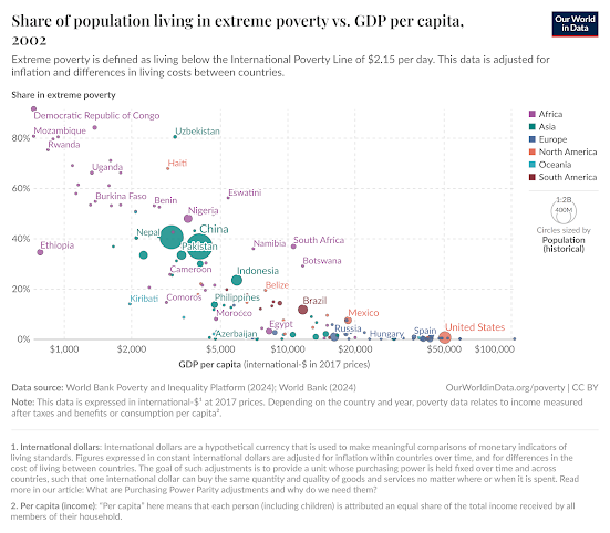
Of course, measurement errors can be substantial along both axes, but classically measurement errors obscure or reduce correlation, but the qualitative results seem robust. Overall growth in an economy reduces extreme poverty, a point that’s been elaborated in a number of more detailed papers such as Dollar and Kraay (2002), Dollar Kleineberg and Kraay (2016) and Donalson (2008).
This chart shows the relationship between country level data on extreme poverty rates the vertical axis and GDP per capita on the horizontal axis. The data are from 2002; in the moment will examine date of from more recent periods. It is unsurprising that there are few if any prior living in countries at the level of below two dollars a day once we passed through the threshold of say $20,000 and GDP per capita. It is also unsurprising that below $20,000 threshold, there is a correlation between GDP per capita and extreme poverty. Less productive countries have more extreme poor. But it may surprise to see how much variance there is any of these GDP is below $20,000. For example at $5,000 GDP per capita, Eswatini's poverty rate is over 50 percent, while Morocco, the Philippines, and several smaller countries have extreme poverty below 20 percent. Around $2,000, Bangladesh and Tajikistan have $2 poverty below 40 percent, while Burkina Faso and Hait are around 60 percent.
This chart presents data from 2002, a good two decades ago. What’s been happening since? Let’s compare this to the next slide.

Qualitatively, the 2022 chart is similar to the previous chart from 2002. Once again, there is no measurable extreme poverty below $20,000 in GDP per capita; in fact in this data it’s hard to find any countries with measurable extreme poverty below $10,000. Below that per capita GDP threshold, there is again a negative correlation between output and poverty rates. Again there is lots of variation in extreme poverty at any of the lower income levels. But notice that after two decades most countries have shifted to the right, compared to the 2002 chart. GDP per capita has risen for most (not all) countries during that period. In most countries (not all), extreme poverty has fallen as per capita GDP has risen. Interestingly, when we compare the two periods, extreme poverty has also decreased somewhat at any particular income level.
Two countries that matter most in terms of headcounts have shown improvement: China has, according to their reported surveys, virtually eliminated extreme poverty; India also shows substantial improvement along both axes.
Some other countries are more complicated. While extreme poverty has fallen and per capita GDP has risen in
many sub-Saharan African countries, progress in much of the continent has been modest at best, and several countries have regressed, for example the Democratic Republic of Congo and Zambia; in Haiti, initial progress in the first decade of this data were reversed, with extreme poverty now estimated at 31 percent, having regressed to the level measured two decades ago.
The two charts above present two snapshots two decades apart, and for the $2.15 extreme poverty threshold. Let us examine the global progress at three thresholds, loosely referred to as $2, $4, and $7.

While the $2/day (actually $2.15 in many recent analyses) is the most widely used threshold in many studies of global poverty, in this chart we examine estimates of world poverty at three different thresholds: $2.15 per day, $3.65 per day, and $6.85 per day. Loosely, we will refer to these as the $2, $4, and $7 thresholds.
(The black dotted line at the bottom is 3% of world population, meant to represent a World Bank internal benchmark of reducing extreme poverty to below 3% of global population, since complete elimination to zero is presumed unrealistic.)
The first of these two related charts provides poverty headcounts. Global poverty at the $2 threshold peaked circa 1993, at about 2.0 billion persons. By 2022, the population at this level of extreme poverty had declined to an estimated 0.7 billion. During this same time frame, global population rose from 6 billion to 8 billion. The share at the most extreme level (second chart) has actually been falling fairly steadily from over a third in 1990 to about 9 percent in 2022.
There have also been declines in both the number and share of poor at the other two thresholds pictured, although it is not surprising that these declines are somewhat less pronounced. At the $4 level, the poverty headcount peaked around 1999 at 3.2 billion, falling to 1.8 billion today. At the $7 level, the peak came later, in 2003, at 4.3 billion, falling more slowly to 3.6 billion today.
An
iconic photo by Massimo Vitali for the New York Times Magazine, February 28, 2013. Sao Paulo’s Morumbi district, with posh apartments on the right (note the swimming pools on the balconies), and the Paraisopolis favela on the left.
Poverty Rates Vary by Region; But Region is NOT Destiny!
The next three charts present poverty rates at the three thresholds, for five regions, and the global total. I have created these charts from data downloaded from the World Bank's
Poverty and Inequality Platform.
The regions in these three charts are as follows:
- EAP, East Asia and Pacific (including China)
- LAC, Latin America and the Caribbean
- MENA, Middle East and North Africa
- SAS, South Asia (including India)
- SSA, sub-Saharan Africa
- World is self explanatory
As we noted above, the global poverty rate at this threshold has declined substantially over the past four decades, from over 40 percent in 1981 to about 9 percent today. But here we see the substantial regional variation. EAP has declined rapidly, from over 80 percent (when China was just beginning Deng-era reforms) to near zero today. LAC and MENA started out much lower; LAC has shown progress, but progress in MENA has stalled out, as conflicts have lead to deteriorating conditions in Syria, Yemen, Libya, and Palestine. South Asia has shown substantial progress, though less rapidly than EAP. Sub-Saharan Africa, which started out high (around 50 percent) but below South and East Asia, stagnated during the first two decades shown, then progressed slowly.

Qualitatively, the five regions behaved in similar fashion at the $4 threshold, though by construction the poverty rates at this higher threshold are themselves higher.
At our final threshold the ranking of regions remains roughly the same. South Asia and sub-Saharan Africa have shown little progress, and MENA and LAC have done just a little better.
As we bring this long post to an end, let us note that these regional averages are interesting, but can be over-emphasized. There are many countries in every region that have out-performed their regional average in reducing poverty: Botswana, Rwanda, Ethiopia, Vietnam, Bangladesh, Chile, Uruguay, Bolivia, Jordan, Georgia, Armenia bear further investigation for their above-average performance over significant periods. China, and India, of course, to some extent "are" their regional performances given their size. At the other extreme, besides the MENA countries mentioned above, performance has disappointed in Nigeria, DR Congo, Laos, Myanmar, Pakistan, Afghanistan, Venezuela, Honduras, Guatemala, and Haiti.
We will have more to day about some of these country experiences, and hypotheses about their causes, for good and ill, in the second post in this series, which I hope to draft this summer.
Digging Deeper Into Data
Hans Rosling (1948–2017) was a Swedish physician, academic, and global health expert best known for his work making global statistics understandable and accessible to the public. A professor of international health at Sweden’s Karolinska Institute, Rosling first rose to prominence for his animated presentations explaining global development trends, health outcomes, and income distributions. He co-founded the
Gapminder Foundation, an educational non-profit designed to promote a fact-based worldview. Through Gapminder’s tools and presentations, Rosling emphasized that, contrary to widespread pessimism, global living conditions have improved dramatically over time, though large inequalities persist.
Rosling’s family continued and expanded this mission. His son Ola Rosling, a statistician and designer, and daughter-in-law Anna Rosling Rönnlund, a data visualization specialist, co-developed several of Gapminder’s most important projects. Together, they worked on Trendalyzer, a dynamic software for visualizing time-series data, which was later acquired by Google. In 2018, the Roslings co-authored Factfulness, challenging widespread misconceptions about global development using reliable data and clear reasoning.
Two of Gapminder’s most notable initiatives are the Gapminder Tools, and
Dollar Street. The Gapminder Tools website offers interactive visualizations of global statistics on health, income, education, and more, allowing users to explore development trends across countries and over time. Dollar Street is a unique project led by Anna Rosling Rönnlund that brings abstract income data to life through photographs. By photographing hundreds of families around the world and organizing their homes and possessions along a “street” based on monthly income, Dollar Street illustrates how people’s living conditions, aspirations, and challenges vary with income, not nationality. These tools collectively aim to bridge the gap between complex data and everyday understanding, encouraging a more nuanced and hopeful view of the world.
Max Roser is a German-born Oxford economist who specializes in the study of large-scale global issues such as poverty, health, inequality, and climate change. Roser is best known as the founder and director of Our World in Data. The platform uses interactive charts and maps to illustrate research findings, often taking a long-term view to show how global living conditions have changed over time. Topics covered include population and demographic change, health, energy and environment, food and agriculture, poverty and economic development, education and knowledge, innovation and technological change, living conditions, community and wellbeing, human rights and democracy, and violence and war. Key collaborators with Roser include
Hannah Ritchie, Esteban Ortiz-Ospina, Joe Hasell and Jaiden Mispy.
The World Bank’s
World Development Indicators (WDI) compiles cross-country development data, offering more than 1,600 time-series indicators for about 200 economies. These indicators cover a broad range of topics, including poverty, education, health, environment, trade, infrastructure, and governance. The platform allows users to browse, filter, visualize, and download data. The WDI is updated quarterly and underpins key World Bank publications such as the World Development Report.
While the WDI is an excellent starting point for country-level data on a wide range of topics, including GDP, incomes, and poverty, two other World Bank resources drill down further into poverty.
The
Living Standards Measurement Study (LSMS) is a research initiative launched by the World Bank in 1980 to improve the quality, availability, and policy relevance of household survey data in developing countries. LSMS surveys are large-scale, nationally representative household surveys that collect detailed data on income, consumption, employment, education, health, agriculture, and access to services. These surveys provide the empirical foundation for measuring poverty, inequality, and other dimensions of welfare, and are frequently used to inform evidence-based policymaking. LSMS supports national statistical agencies by offering technical assistance in survey design, implementation, and analysis, and emphasizes methodological rigor, innovation (e.g., integration with geospatial and climate data), and transparency. The program’s website hosts survey documentation, datasets (via the World Bank’s Microdata Library), and research outputs. LSMS data underpin major analytical tools like the Poverty and Inequality Platform (PIP) and contribute significantly to global poverty monitoring.
The
Poverty and Inequality Platform (PIP) is the World Bank’s central hub for harmonized data on global and national poverty and inequality. PIP provides access to comparable estimates of poverty rates, income and consumption distributions, and inequality metrics such as the Gini coefficient, across countries and over time. Built on microdata from over 2,000 household surveys, the platform allows users to analyze global, regional, and national poverty trends based on a standardized methodology. The PIP website features interactive dashboards, downloadable datasets, and tools for generating custom charts and poverty lines, including international and national thresholds.
What Next? Another Blog Post!
Since his death got us started on this post, let’s let Pope Francis have the last word:
“The measure of the greatness of a society is found in the way it treats those most in need, those who have nothing apart from their poverty.” (The Spirit of St Francis, 2015, p. 128).
That’s a nice transition to the next post in this series, which I will draft this summer, in which we will explore how we might meet some of those needs, most effectively.
Reading for Life
Students reading under street lamps at Guinea's G'bessi Airport
If I had to pick one book that’s easily accessible to general readers but also worthwhile for specialists in the field, I’d start with Angus Deaton’s The Great Escape.
For a deeper dive, I highly recommend Martin Ravallion’s The Economics of Poverty. For non-economists, flipping through Ravallion’s book might be slightly intimidating, but he has conveniently put most of the technical material in separate boxes that general readers can skim if they wish.
Alkire, Sabina, Usha Kanagaratnam, Ricardo Nogales, and Nicolai Suppa. "Revising the Global Multidimensional Poverty Index: Empirical Insights and Robustness." Review of Income and Wealth 68 (2022): S347-S84.
Bhalla, Surjit. Imagine There's No Country: Poverty, Inequality, and Growth in the Era of Globalization. Peterson Institute, 2002.
Bourguignon, François. "The Poverty-Growth-Inequality Triangle: With Some Reflections on Egypt." Egyptian Center for Economic Studies, 2005.
Bourguignon, François, and Christian Morrisson. "Inequality among World Citizens: 1820-1992." American economic review 92, no. 4 (2002): 727-44.
Chen, Shaohua, and Martin Ravallion. "The Developing World Is Poorer Than We Thought, but No Less Successful in the Fight against Poverty." The Quarterly Journal of Economics 125, no. 4 (2010): 1577-625.
Collins, Daryl, Jonathan Murdoch, Stuart Rutherford, and Orlanda Ruthven. Portfolios of the Poor: How the World's Poor Live on $2 a Day. Princeton University Press, 2009.
Davies, Richard. Extreme Economies: What Life at the World's Margins Can Teach Us About Our Own Future. Random House, 2019.
Deaton, Angus. The Great Escape: Health, Wealth, and the Origins of Inequality. Princeton University Press, 2013.
———. "Measuring and Understanding Behavior, Welfare, and Poverty." American Economic Review 106, no. 6 (2016): 1221-43.
Dollar, David, Tatjana Kleineberg, and Aart Kraay. "Growth Still Is Good for the Poor." European Economic Review 81 (2016): 68-85.
Dollar, David, and Aart Kraay. "Growth Is Good for the Poor." Journal of Economic Growth 7, no. 3 (2002): 195-225.
Donaldson, John A. "Growth Is Good for Whom, When, How? Economic Growth and Poverty Reduction in Exceptional Cases." World development 36, no. 11 (2008): 2127-43.
Fosu, Augustin Kwasi. "Growth, Inequality, and Poverty Reduction in Developing Countries: Recent Global Evidence." Research in Economics 71, no. 2 (2017): 306-36.
Hasell, Joe, Bertha Rohenkohl, Pablo Arriagada, Esteban Ortiz-Ospina, and Max Roser. "Poverty." Our World in Data, 2022.
Hobbes, Thomas. Leviathan. (Longman Library of Primary Sources in Philosophy). Routledge version, 2016, 1651.
Malpezzi, Stephen. "Urban Housing and Financial Markets: Some International Comparisons." Urban Studies 27, no. 6 (December 1990): 971-1022.
Pinkovskiy, Maxim, and Xavier Sala-i-Martin. "Parametric Estimations of the World Distribution of Income." National Bureau of Economic Research, 2009.
Ravallion, Martin. The Economics of Poverty: History, Measurement, and Policy. Oxford University Press, 2016.
Rosling, Hans, Ola Rosling, and Anna Rosling Rönnlund. Factfulness: Ten Reasons We're Wrong About the World--and Why Things Are Better Than You Think. St Martin's Press, 2018.
Rosling Rönnlund, A. "Dollar Street-Photos as Data to Kill Country Stereotypes." Gapminder. https://www. gapminder. org/dollar-street, 2020.
World Bank. "Poverty, Prosperity, and Planet Report 2024: Pathways out of the Polycrisis." Washington, D.C., 2024.
———. "World Development Report 1990: Poverty." Washington, D.C., 1990.
———. "World Development Report 2006: Equity and Development." Washington, D.C., 2006.
The reading list above comprises a short list of books and papers on poverty, mainly by economists. Novelist Gao Xingjian argues that “It’s in literature that true life can be found. It’s under the mask of fiction that you can tell the truth.” I would respectfully (since Gao has a Nobel and I do not) suggest that carefully done economics can reveal some truths as well, but here is some literature – fiction and non-fiction – that might provide some insights:
Achebe, Chinua. Things Fall Apart. London: Heinemann, 1958.
Boo, Katherine. Behind the Beautiful Forevers: Life, Death, and Hope in a Mumbai Undercity. Random House Digital, Inc., 2012.
Chang, Jung. Wild Swans: Three Daughters of China. Simon and Schuster, 2003.
Chang, Leslie T. Factory Girls: From Village to City in a Changing China. Random House, 2009.
de Balzac, Honore. Le Pere Goriot. Vol. 6: JM Dent, 1895.
Mahfouz, Naguib. The Cairo Trilogy: Palace Walk, Palace of Desire, Sugar Street; Introduction by Sabry Hafez. Everyman's Library, 2016.
Mehta, Suketu. Maximum City: Bombay Lost and Found. Random House Digital, Inc., 2009.
Naipaul, V.S. A House for Mr. Biswas: A Novel. Vintage, 1961.
Orwell, George. The Road to Wigan Pier. London: Victor Gollancz, 1937. (First half; skip the second).
 |
| https://www.filmlinc.org/films/bicycle-thieves/ |
In any event, here are a few films that give some insights that complement the numbers presented above.
The Bicycle Thief (Vittorio De Sica 1948). One of the foundational films of Italian neorealism, set in post-WWII Rome, revolving around the theft of a bicycle with disastrous results for a poor family.
The Boy Who Harnessed the Wind (Chiwetel Ejiofor, 2019). A Malawi village faces a disastrous drought; a largely self-taught schoolboy (whose family could not afford school fees) replaces the village’s broken water pump with a jerry-built windmill, after desperate losses finally convince his father and other villagers to risk their meager assets on his solution.
City of God (Fernando Meirelles and Kátia Lund, 2002). Fictional depiction of a Rio drug war in the Cidade de Deus slum over several decades.
Great Expectations, Oliver Twist (David Lean, 1946, 1948). If you want insights into 19th century Dickensian poverty, well, see films of Dickens’ works.
Hotel Rwanda (Terry George, 2004). Drama based on the efforts of hotel manager Paul Rusesabagina (a Hutu) and his wife Tatiana (a Tutsi) to save the lives of over a thousand refugees during the 1994 Rwandan genocide.
My Brilliant Friend (Saverio Costanzo; additional direction by Alice Rohrwacher, Daniele Luchetti, Laura Bispuri; series 2018 to 2024). Based on Elena Ferrante’s Neapolitan quartet of novels, revolving around the coming of age of two poor young women in Naples, in the 1950s and beyond.
Parasite (Bong Joon Ho, 2019). Black comedy about a poor family who gradually infiltrates the life of a wealthy family; the stark contrast of the two families’ housing is particularly powerful. I’d like to re-write the ending, though.
Roma (Alfonso Cuarón, 2018). Semi-autobiographical film contrasting the lives of a upper middle class Mexican family and their maid.
Salaam Bombay! (Mira Nair, 1988). Classic film depicting the struggles of Mumbai children drawn into a world of drugs and prostitution.
Slumdog Millionaire (Danny Boyle, 2008). Adaptation of a novel depicting children coping with life in a Mumbai slum, surrounded by violence and corruption as well as poverty; with more than the usual difficulties, an Indian quiz show offers a way out.


.png)


